Or
Packet Capture Analysis Can Uncover Surprising Behaviours That Can’t Be Found in Any Other Way
Or
The TCP “IP ID” Field Can Provide Valuable Insight into “Upstream” Behaviours That We Can’t Directly Observe.
Or
Why Permanent Packet Capture Appliances Speed Up Troubleshooting Exercises
Tracking down an application problem within a multi-vendor environment
In this case study, an application provided by a third party vendor was often failing to initialize correctly on the customer’s PC.
The network path between the user PC and the vendor’s application server traversed the customer’s network, network provider WAN, a third party data centre and finally the software vendor’s compartment where the application was hosted.
Although packet captures were taken at the client PC as well as the server, the exact nature of the issue could not be determined until captures were taken simultaneously at three different locations in the path.
Initial Engagement
At the beginning of this troubleshooting engagement, available facts were quite sparse.
Questions were asked in order to separate facts from opinion, hearsay, guesses or other non-factual information. At this stage of any engagement, everything is taken with a grain of salt and is subject to verification during the analysis stage.
Problem Statement
The reported problem was that an application often didn’t launch properly – the user got an error message after 2 or 3 minutes had elapsed. It didn’t happen all the time, but often enough for complaints. Furthermore, even when the application did launch properly, it took well over a minute to do so.
Initial Statements
- The customer had purchased an application from a third party supplier.
- The client component of the application ran on a user’s PC, within the customer’s office in City-A.
- The application interacted with the provider’s server which was located in City-B (different state).
- The network linking the user’s PC to the server traversed a path that had at least 4 different owners:
- The user’s own internal network.
- A network provider.
- An outsourced data centre network.
- The application provider’s server farm component within that data centre.
- The WAN link to the customer was only 192Kbps.
- There were no WAN accelerator devices in the path.

The Approach
I was engaged by the network provider and did not have direct access to either the customer or application provider (contact with the data centre operator was even more difficult). The approach was to arrange for packet captures to be taken simultaneously at three locations, as indicated by the yellow hexagonal numbers in the diagram below.
The network provider staff were able to arrange this, performing their own capture on their own switch and working with the customer and application provider to install and run Wireshark on the User PC and the Server.
As it turned out, the reason for the problematic application launch behaviour could not be properly determined without analyzing all three of those captures. As we shall see, we were also quite lucky that third capture was at the customer’s end of the WAN rather than the data centre end.
However, the eventual “root cause” was not what anyone was expecting.
This study is therefore broken into four parts – the analysis of each individual capture followed by the final conclusions drawn from all three captures.
What We Could Infer
- It was very likely that the customer has a firewall between its internal network and WAN.
- It was also very likely that there is firewall at the data centre end.
- There was probably a load balancer somewhere in the data centre, in front of the server.
- We should be prepared for other devices such as proxies to be involved.

Dotted lines represent as yet “unknown” devices or factors.
Part 1 – The User PC
Wireshark was installed on the user’s PC and set to run in ring-buffer mode. This allowed a capture to be extracted that caught test runs of the application containing examples of both a “good” launch as well as a “bad” launch.
This initial capture analysis helps to determine some facts and enables some inferences to be made, from past experience. However, as we shall see, we did’t get enough evidence to conclusively identify the actual cause of the problem.
The Analysis
Once a useful capture file was eventually made available, the analysis for the user PC took about two hours.
It had taken just under two weeks from the initial engagement for all the parties to setup the capture mechanisms and have them running during an example of the “bad” program launch behaviour.
Thus, had permanently installed packet capture appliances already been in place, we could have significantly reduced the time from the start of engagement to the final outcome.
High Level View
The very first chart gives a high level view of all the clients, servers and services that are represented in the captured data.
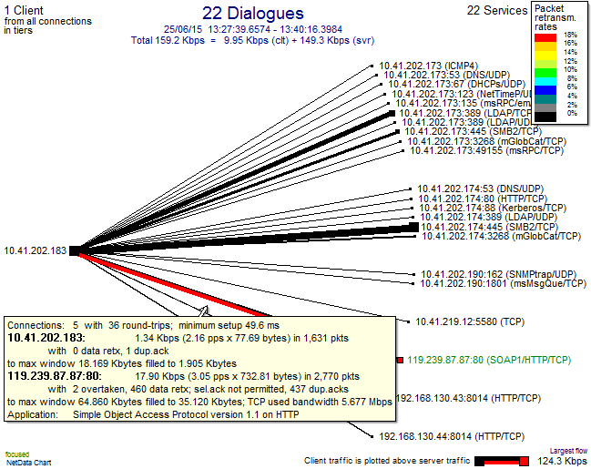
The above chart shows clients on the left hand side and services on the right. The thickness of the lines reflects data volumes in each direction. The colour, in this case, highlights large packet retransmission rates. We can see at a glance that only one server connection has problems – with a retransmission rate of 18%.
This is the web server that drives the application experiencing the problems.
The popup on the line shows more details of the client-server activity:
- There were 5 TCP connections from this client to that server.
- The server is nearly 50 ms away from the client.
- Most of the data flow is from the server to client (“download”).
- There were 460 retransmitted packets out of a total 2770.
- There were also 437 duplicate acks from the client to the server.
- The Selective Ack TCP/IP feature was not supported on these connections.
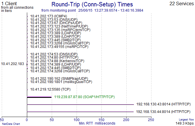
Another option on this chart type is to plot all the round trip times as observed from the point of capture. We can see that:
- Most of the servers that this client connects to are local (the IP addresses on the same subnet would also hint at that).
- The capture was taken very close to the client (in fact, it was within the PC).
- There are a couple of other servers over 200 ms away, but with small volumes.
The “distance” of 50 ms is fairly large, so we should be on the lookout for “chatty” application behaviour.
Connections
The Connections Table shows the 5 TCP connections that were captured. The closures by TCP Resets, both from the server and the client catch our eye here. We can use this to begin to get a view of normal vs non-normal behaviours.
The first row is the connection containing the “good” behaviour and the highlighted row is the one containing the “bad” behaviour.
Note the very high levels of server retransmissions, “ReTx”, in both connections.
Transaction View
It is much more interesting and revealing to look at individual transactions.
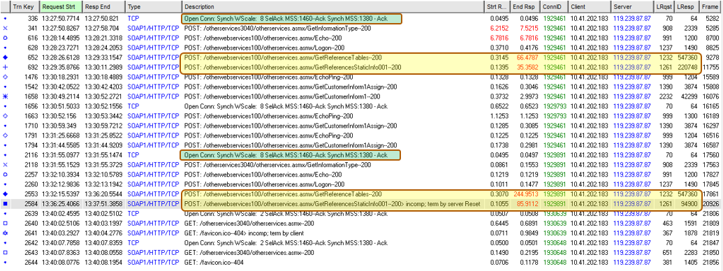
The analysis now examines just the client/server connections that involve the problem behaviour. The table below lists all the transactions within the 5 connections between our one client and the one server. The 3-way handshake information is in green and the pairs of the two largest transactions in yellow. “Start R(esponse)” is the time the server took to think about the answer, “End Resp” minus “Strt Resp” tells us the time to deliver the answer over the network.
In the TCP/IP 3-way handshakes, note that the client PC offers an MSS of 1460, support for Selective Acks and a Window Scale of 8 – all of which is normal for a modern Windows PC. However, the “server” responds with an MSS of just 1380, no Selective Ack and no Window Scaling.
In the “good” example, there was a large “GetReferenceTables” POST transaction that involved downloading close to 550KB of data (LResp column) in 66 seconds (End Resp column). This was followed immediately by a “GetReferencesStaticInfo” POST transaction that retrieved 220KB taking 35 seconds.
In the “bad” example, the same 550KB transaction took 245 seconds to complete. The second transaction didn’t complete properly, being terminated by a server Reset after downloading only 94KB.
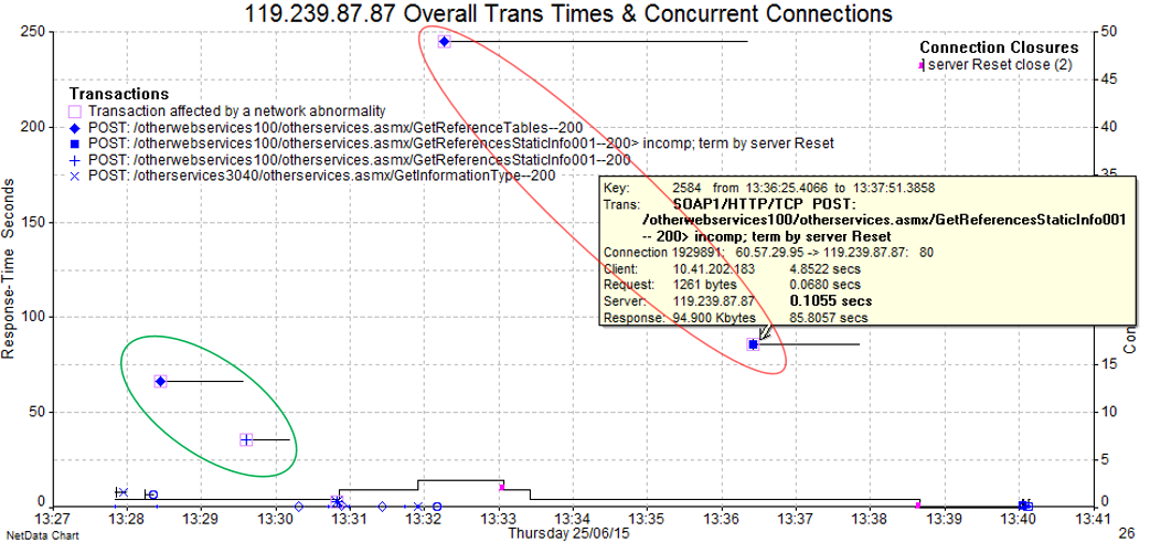
The below graphical view of those same transactions visually shows us that the “good” pair executed much more quickly than the “bad” pair (but we may not call over 90 seconds particularly “good”). Further, that almost all the transaction time was consumed by network delivery rather than server “thinking”.
Note that the x-axis here is time-of-day and the y-axis is time taken per transaction. The horizontal lines indicate the overall start and end of the transaction. Thus, the lines get wider on the x-axis as they are plotted higher up on the y-axis.
The key piece of information is that the “bad” example involved a transaction being terminated by a server Reset. The popup shows us the detailed time breakup between client request (single packet of 1261 bytes taking 68ms) server “thinking” time (105ms) and server response delivery (94KB in 85.8 secs).
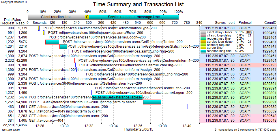
Below is an alternative “waterfall” view (or Gantt style) of the same transactions, providing a different visualization. Some of the smaller POST transactions consumed mostly server time (yellow) whereas most of the larger POSTs were consumed by network delivery from the server (blue). The client reaction time (grey) is the time between the various transactions. Mostly this will represent the user reading the results of previous responses or thinking about what to do next.
Focus on the Failed Transaction
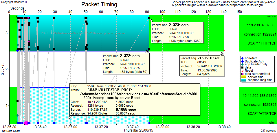
By plotting a Packet Timing chart of that last “bad” POST transaction we get a view of the way packets flowed between the client and server. The popup is just to confirm that this is the same transaction as in the previous charts.
This chart can be thought of as a horizontal “bounce” or “ladder” diagram, but is far richer in the information it conveys.
The packets are displayed at their actual time-of-day (x-axis), providing many visual cues. The y-axis contains 3 rows, with packets from the client PC all being in row 1, packets from the server are in row 3 (and row 2 is just a blank separator). Shapes and colours are used to differentiate packet types (see legend). Black squares are normal data packets and we can see some purple squares showing packets that were retransmitted. Variations of blue diamonds represent different types of Acks.
The vertical position of the packets indicates their payload size. The two popups on some server packets show that 1380 is the largest size here (consistent with the 3-way handshake) but there are also many packets with a payload of just 80 bytes.
Reading the timescale on the top of the chart, the client’s request was at 5 secs and the server’s Reset comes 135 seconds later. We also see clusters of server packets with gaps of 5, 10, 20 & 40 seconds (with 50 seconds to the Reset).
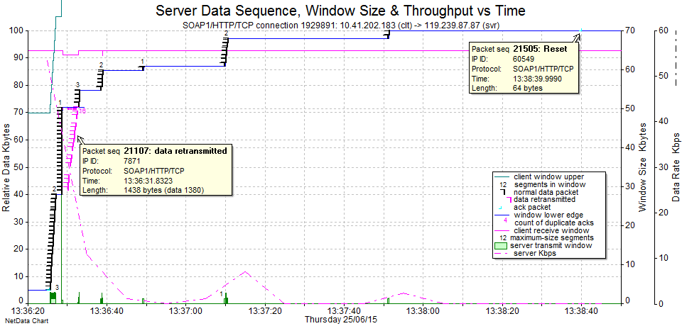
The “Data Sequence” chart below – for the same packets as above – provides even more visualization of the flow.
The y-axis now counts the bytes within the overall flow as each packet arrives. Each black vertical packet marker shows the packet’s size as well as its relationship to other packets within the data flow. Any packets that were lost upstream would cause vertical gaps here (there are none). The blue line underneath the packets represents the client’s acknowledgements. It therefore trails the packets upwards as Acks are observed. Since we are capturing inside the client PC, the PC’s Acks are almost instantaneous, so the blue line hugs the packets tightly. The pink line represents the client’s Receive Window, with the scale on the right hand side. We can see at a glance that there are no window closures.
The three most eye-catching features in this case are:
- The apparently vertical stack of server packets (meaning that they all arrived at virtually the same time).
- The diagonal purple flow (packets that were unnecessary retransmissions or earlier black ones).
- The occurrence of time gaps with increasing durations (which from here appear to be all due to the server).
We now need to zoom in to the interesting behaviour between times 13:36:25 and 13:36:34.
Here we can see the original flow of packets (usually 1360 + 80) in an “escalator” formation at a throughput (pink dashed line with RHS scale) of around 175 Kbps. This is consistent with the known WAN speed of 192 Kbps. The slope angle of the “escalator” therefore represents the rate of packet arrivals across the WAN.
The time gap, followed by a vertical “elevator” formation, visually tells us that there must be a network device within the local network (i.e., at the same end of the WAN as the client) that is holding packets and then, for some reason, releasing them all at once.
I’ve added an orange “trend line” to show us that the top of the “elevator” is roughly at the same position as the “escalator” would have been if there was no buffering. So, overall, not much time has actually been wasted and this behaviour on its own is not a problem.
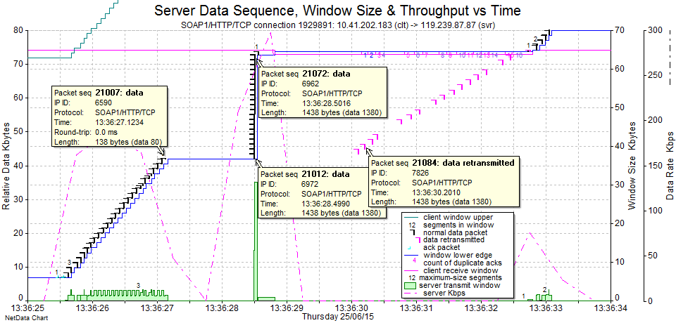
The purple retransmitted packets are of more interest, because they are completely unnecessary. Why would the server retransmit packets that our client has already acknowledged (note the more clear view of the blue Ack line on this chart)? Note also that the purple retransmissions arrive at more like the usual WAN rate.
The most interesting question is why there is a very long time gap before we see the next new (black) packets from the server. This first gap is 13:36:33 – 13:36:285 = 4.5 seconds. We know from the earlier Data Sequence chart that these gaps keep increasing in duration to 5, 10, 20 & 40 seconds. Such a time doubling like that is usually related to a TCP/IP retransmission timeout.
While we have this chart, we can use the popups to discover more details (I hovered on each packet in turn to see the underlying data, but I’ve only left a few on display so as not to clutter the chart):
- The IP IDs of the packets in the “escalator” are sequential, with 6590 at the top.
- The first packet at the bottom of the “elevator” has IP ID 6972.
- The second packet in the “elevator” has IP ID 6626.
- The second “escalator” flow at time 13:36:33 seems to be a continuation of the purple flow.
- The packet payload sizes seem to always be in groups of two – adding up to 1460 (mostly 1380 + 80 but sometimes others such as 873 + 587).
The official RFC definition for IP ID is related to packet fragmentation – and it is populated differently by different operating systems and TCP stack implementations. However, with Microsoft Windows, the IP ID acts as a sequential numbering of packets as they leave a sender (across all connections). They can often provide very useful information in cases like this because we can deduce retransmissions that came from the real, original sender rather than an intermediate device. A retransmission will have larger IP ID because it was transmitted later (subject to wrapping after 65535 – since the IP ID is 16 bits long).
We can make some solid inferences from all the above:
- The next packet in the “escalator” sequence should have been IP ID 6591. So the original 6591 must have been lost somewhere before it arrived at the local “buffering device”.
- Subsequent packets did arrive but were buffered (IP ID 6962 left the server before 6972).
- The “buffering device” must have reported the packet loss to the “real” server, which eventually retransmitted IP ID 6591’s payload data in IP ID 6972.
- Once that gap in the flow was filled at the “buffering device”, it then released all the buffered packets at once.
- A large sequence of data (most of the 30KB “elevator”) was retransmitted from the “real” server. A large portion of the 4.5 second gap is likely due to that, but there is still at least 1.5 seconds unaccounted for.
Unfortunately, there is no explanation here for the increasing larger time gaps (5, 10, 20 & 40 secs) in the flow.
There is also no definite explanation for the server’s Reset. We might guess that it is time-related but there is no hard evidence for this.
Application Layer
Examining the HTTP header information for the various POST transactions, we can see that there is no compression and no caching. Given the quite low speed of this WAN link, the application launch time would be much improved if compression and caching were both enabled.
Here are the Request and Response HTTP Headers from the 550 KB transactions.
Request Signature:
/otherwebservices100/otherservices.asmx/GetReferenceTables
Length: 1,232 bytes
Frame: 9278
Header:
POST /otherwebservices100/otherservices.asmx HTTP/1.1
User-Agent: Mozilla/4.0 (compatible; MSIE 6.0;
MS Web Services Client Protocol 2.0.50727.5472)
Content-Type: text/xml; charset=utf-8
SOAPAction: "http://www.serverco.com/webservices/GetReferenceTables"
Host: 119.239.87.87
Content-Length: 906
Expect: 100-continue

Response Signature: 200
Length: 547,360 bytes
Frame: 11257
Header:
HTTP/1.1 200 OK
Cache-Control: private, max-age=0
Content-Type: text/xml; charset=utf-8
Server: Microsoft-IIS/7.5
X-AspNet-Version: 2.0.50727
X-Powered-By: ASP.NET
Content-Length: 547127
What Have We Discovered?
Although we don’t yet have enough facts to fully identify the underlying root cause of the stated problem, we have uncovered quite of lot of useful details.
We have a good idea of where we need to look next – and also have some probing questions to ask the relevant parties.
Facts and Hard Inferences
A program launch involves over 800 KB of downloaded data, with two large transactions consuming the bulk of that data volume. Therefore, on the 192 Kbps WAN link, the best-case timing for a successful launch cannot be under 35 seconds (assuming one user with no other WAN traffic at the same time).
There is no compression of the downloaded data (and no caching).
There is a “buffering device” somewhere at the customer’s end of the WAN.
There are packet losses somewhere in the network path (but not “seen” by the client PC).
Packets are arriving in “pairs” with payloads that add up to 1460 bytes.
The PC supports an MSS of 1460, Selective Ack and Window Scaling, but the server (or other device in the path) specifies an MSS of 1380 with no Selective ACK and no Window Scaling.
Other Inferences
We can also make some “softer” inferences that will give us some more questions to ask the various parties or alert us to behaviours to look out for in the other captures:
- It is likely that the “real” server output packets have a payload of 1460 and there is another device in the path (we can’t tell where) that is breaking them up into 2 pieces. If so, the SYN-ACKs in our observed 3-way handshakes must therefore not come from the “real” server. From past experience, F5 load balancers exhibit this sort of behaviour.
- From past experience, the MSS value 1380 along with the disabling of the Selective Ack function provides a hint that at least one of the firewalls may be a Cisco ASA. The Cisco “Initial Sequence Number (ISN) Randomization” feature disables Selective Ack by default.
- The increasing larger time gaps (5, 10, 20 & 40 secs) in the flow are consistent with a transmitter’s Retransmission Timeout mechanism. We know from the IP IDs that there are upstream packet losses and retransmissions, so we need to find them in the other captures.
Updated Diagram
We were able to verify that the customer did have a firewall and it was a Cisco ASA. They also told us that there was no proxy server of any kind (that would act like the “buffering device” we discovered). For now, we will assume that the ASA firewall is doing the buffering (but need to seek further confirmation) until the other captures tell us otherwise.

We now have more solid lines than before.
Recommendations
Now that we have observed the various POST components involved in the launch of the program, we can already make some useful recommendations to the application provider.
We observed that there were two large “downloads” of 550 KB and 220 KB, which were XML files containing initialisation data. On the low speed WAN link here, these could never take less than around 35 seconds in the absolutely best case. Furthermore, the content looked fairly static in that it perhaps didn’t often change.
We can make two recommendations:
- If the client and server components were both made to support compression, the normally long initial load time could be reduced by a factor of at least 4, reducing the initial load time from 35 seconds to 10 seconds or less.
- If the application was modified to include some client-side caching, then average load times could be reduced even further.
What Next?
So far, we haven’t found the true underlying cause. We need to examine the other captures from the other locations.

In the follow-on parts of this overall case study, we’ll examine:
- Part 2: The capture taken within the server.
- Part 3: The capture taken at the network provider’s switch, just inside the customer’s premises (i.e., at the customer’s end of the WAN link).
- Part 4: Putting it all together. Finding the real cause(s) and trigger events. Making recommendations.


